Typography has always been at the heart of communication—used to inform, express, persuade, and inspire. But in the digital age, it has undergone a dramatic transformation. No longer limited to ink and paper, modern typography must adapt to screens, devices, and dynamic interfaces.
In this article, we’ll explore the journey of typography from its historical roots to its current digital form—highlighting key milestones, design trends, and emerging technologies that continue to shape how we read and communicate today.
1. A Brief History of Typography
Typography as a design discipline dates back centuries:
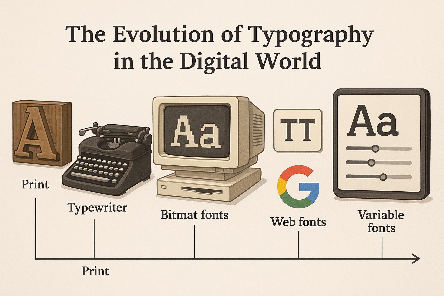
- 1450s: Johannes Gutenberg invents movable type with the blackletter font
- 18th century: The rise of transitional and modern serifs like Baskerville and Bodoni
- 20th century: Sans-serif fonts gain popularity for their readability and minimalism (e.g., Futura, Helvetica)
Early typography was deeply tied to the printing press—each font required physical metal casts. Every letter had weight, ink flow, and texture.
In contrast, digital typography has none of those limitations—fonts are now data.
2. The Digital Typography Revolution
The digital age began shifting typography in the 1980s and 90s:
- Bitmap fonts on early computers were pixel-based and crude
- PostScript fonts (introduced by Adobe) allowed high-quality scalable fonts
- TrueType and OpenType made fonts more flexible and cross-platform compatible
Today, designers can install thousands of fonts, render them crisply at any size, and even animate or program how they behave—something unimaginable a century ago.
3. Screen vs. Print: The Typographic Shift
With digital design, typefaces had to evolve for screens:
| Feature | Print Typography | Digital Typography |
|---|---|---|
| Resolution | High (300–1200 dpi) | Low to high (72–300+ ppi) |
| Contrast | Natural with ink | Needs higher contrast |
| Size Flexibility | Fixed sizes | Responsive and scalable |
| Layout | Static pages | Dynamic, interactive layouts |
4. Responsive Typography
As websites adapt to different screen sizes (mobile, tablet, desktop), so must the fonts.
Responsive typography ensures that:
- Font sizes scale with screen dimensions
- Line length and spacing remain readable
- Hierarchy and emphasis adjust across devices
Techniques include using viewport-based units, fluid typography, and media queries to fine-tune text for optimal legibility.
5. The Rise of Web Fonts
Before 2009, designers had to stick with a few “web-safe” fonts (Arial, Times New Roman, etc.). Then came the web font revolution.
Thanks to tools like:
- Google Fonts (free and open-source)
- Adobe Fonts
- Font hosting services like Fontspring and Fontstand
…designers now enjoy vast typographic freedom online—without worrying about system compatibility.
Web fonts made branding consistent across print and digital platforms.
6. Variable Fonts: The Future of Type
Introduced in 2016, variable fonts are a game-changer.
Instead of multiple font files (bold, italic, condensed, etc.), a single variable font file includes all styles—adjustable with sliders or code.
Benefits:
- Smaller file size (better performance)
- More creative control
- Smoother transitions (animations, hover effects)
- Interactive UI/UX applications
Fonts like Inter, Roboto Flex, and Recursive show how flexible and future-forward typography can be.
7. Typography in UI/UX Design
Modern typography is no longer just decorative—it’s functional.
In UI/UX:
- Fonts must be readable at all sizes
- Maintain consistent hierarchy
- Be accessible (considering contrast, weight, spacing)
- Load fast for performance
Fonts are chosen not just for looks—but for how they behave.
8. Typographic Branding in the Digital Era
Typography has become a core component of branding:
- Netflix uses custom typefaces like Netflix Sans
- Google created Product Sans
- Coca-Cola has used the same Spencerian script for over a century—digitally refined
More brands now commission custom fonts to reflect identity, tone, and even culture. Typography is brand voice, even before a word is read.
9. AI and Typography
Artificial Intelligence is beginning to play a role in type:
- Font pairing suggestions (e.g., Fontjoy, Adobe Sensei)
- Generative typography tools that morph fonts in real time
- AI-generated font designs using GANs and deep learning
- Text recognition & auto-alignment in creative software
While AI can’t replace human typographic nuance, it enhances speed and experimentation.
10. Common Trends in Modern Digital Typography
Here are the most popular trends shaping digital typography today:
| Trend | Description |
|---|---|
| Variable Fonts | Interactive, customizable, future-proof |
| Brutalist Typography | Bold, raw, anti-aesthetic fonts |
| Serif Comeback | Serif fonts returning to digital with a twist |
| Large Display Text | Hero fonts dominating homepages |
| Kinetic Typography | Animated and scroll-triggered motion text |
| Type as UI | Fonts that react to interaction, hover, clicks |
11. The Role of Open Source and Font Communities
The rise of free, open-source font platforms has democratized design. Google Fonts, Velvetyne, The League of Moveable Type—these communities:
- Promote typographic experimentation
- Encourage diversity in languages and scripts
- Make design accessible to all creatives
This has led to broader representation and more culturally aware design in the global digital landscape.
12. Conclusion: Where Typography Goes from Here
Typography has come a long way—from carved stones to responsive web animations. In the digital world, it’s faster, smarter, more flexible—and more human than ever.
As devices evolve, so will fonts. Think:
- AR/VR typography
- Voice-activated type
- Fonts that adapt to screen brightness or mood
The future of typography is interactive, intelligent, and always expressive.
Designers who embrace its evolution—not just the aesthetics, but the function—will shape the next era of communication.