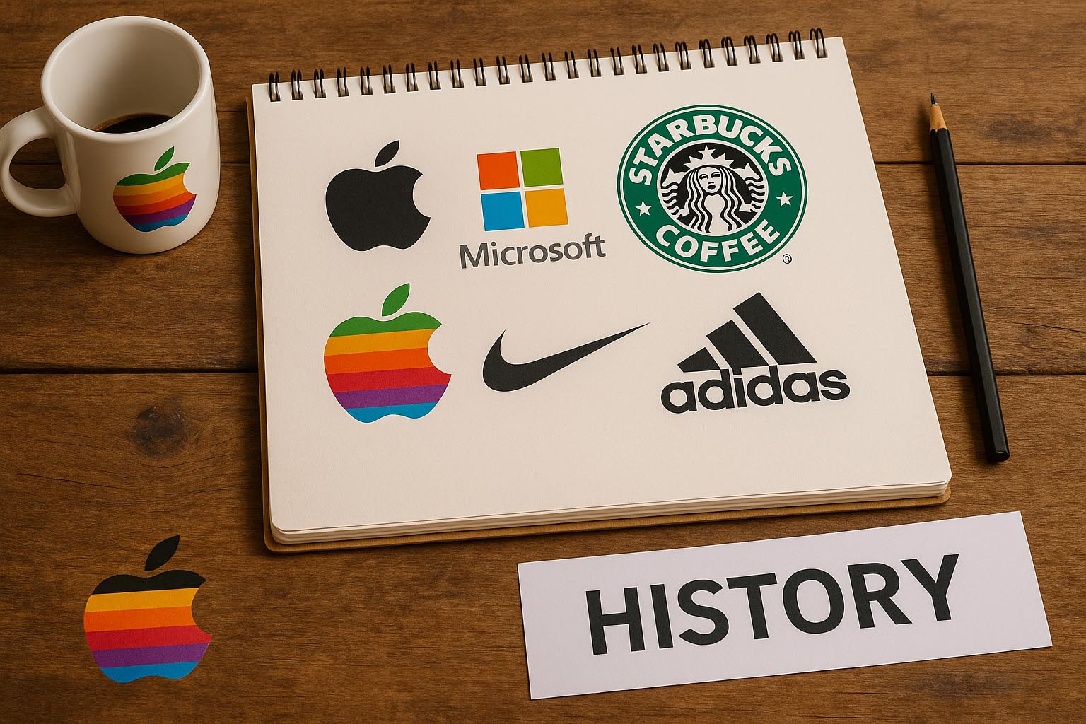
Logos are more than just shapes and colors—they are living symbols of brand identity, cultural relevance, and trust. From a half-bitten apple to three simple stripes, some logos have become instantly recognizable worldwide.
But how did they start? What did the first versions look like? And what lessons can we learn from their evolution?
Let’s travel through time and explore the fascinating stories behind some of the world’s most iconic logos.
1. Apple: From Isaac Newton to Minimalism
The original Apple logo was surprisingly complex—a vintage sketch of Isaac Newton sitting under an apple tree, created in 1976 by co-founder Ronald Wayne.
Soon after, Steve Jobs sought a simpler, more modern look. Enter the famous rainbow-colored Apple logo designed by Rob Janoff in 1977. It represented both accessibility (color for education) and the Apple II’s color display.
Since then, the logo has gone through several stylistic updates:
- 1998: Monochrome version for a sleek, modern look
- 2001: Glass-like 3D version during the iMac era
- 2013–now: Flat, minimalist logo—perfect for digital media
The Apple logo is now a symbol of innovation, simplicity, and premium design.
2. Nike: The $35 Swoosh
Perhaps the most famous logo story in the world, the Nike Swoosh was designed in 1971 by graphic design student Carolyn Davidson. She was paid just $35 at the time.
Inspired by the wings of the Greek goddess Nike, the swoosh represents motion, speed, and athleticism.
Despite its humble beginnings, the logo became legendary—especially after Nike’s partnership with Michael Jordan and the “Just Do It” campaign.
In a full-circle moment, Nike later gave Carolyn Davidson a stock package now worth millions. Proof that great logos can come from small beginnings.
3. Adidas: The Evolution of Three Stripes
Adidas’s iconic three stripes were initially functional—used on shoes to provide support. Over time, they evolved into a symbol.
Here’s a quick look at their evolution:
- 1949: Simple 3-stripe design on footwear
- 1971: Introduction of the Trefoil logo (representing diversity)
- 1991: Launch of the Equipment logo (three angled bars)
- 2002–now: Streamlined and dynamic stripes
Adidas cleverly uses different versions for different product lines, balancing modernity and heritage. All rooted in the same identity: performance and style.
4. Starbucks: From Sea Sirens to Simplification
The original Starbucks logo in 1971 was a brown woodcut-style drawing of a topless twin-tailed mermaid—or siren—from Norse mythology. It represented exoticism and coffee’s seafaring origins.
The logo evolution:
- 1987: Switched to green and added a modern wordmark
- 1992: Cleaned up the siren’s image for wider appeal
- 2011: Removed all text—leaving only the siren
This move was bold: trusting the siren alone to carry the brand. And it worked. Starbucks proved that a powerful image can speak louder than words.
5. Microsoft: From Tech Giant to Human-Friendly
Microsoft’s early logos were harsh, bold, and very “techy.”
- 1975: Wordmark with sci-fi type
- 1987: The “Pac-Man” logo, with a slice taken from the ‘o’
- 2012: Introduction of the colored square logo
The four-color grid represents the diversity of Microsoft’s products:
🟥 Office
🟩 Xbox
🟦 Windows
🟨 Bing
This modern flat design reflects Microsoft’s shift toward being more user-friendly and accessible.
6. Coca-Cola: Script That Never Goes Out of Style
Unlike most brands, Coca-Cola has stayed loyal to its original logo design for over 130 years.
Created in 1887 by Frank M. Robinson, the flowing Spencerian script was intended to express elegance and uniqueness.
Minor adjustments have occurred, but the spirit remains unchanged—making it one of the most iconic and consistent logos in history.
7. Google: Colorful Simplicity with Hidden Logic
At first glance, Google’s logo looks like a child’s toy—playful, colorful, and minimal. But there’s purpose behind the chaos.
- Colors: It uses primary colors (blue, red, yellow) but throws in green to symbolize breaking rules
- Font: A custom, friendly sans-serif
- Evolution: Shifted from 3D shadows and bevels to flat design in 2015
It reflects Google’s DNA: functional, fun, and a little rebellious.
8. Lessons from These Logos
Across all these examples, several powerful lessons emerge:
✅ Simplicity wins: Every successful logo has moved toward a cleaner, more adaptable design over time.
✅ Consistency matters: Repetition builds trust and recognition.
✅ Evolution is healthy: Even iconic brands tweak their logos to stay relevant.
✅ Versatility rules: Logos must work on digital screens, billboards, apps, and packaging.
✅ Emotion connects: A good logo tells a story or evokes feeling.
9. The Psychology of Iconic Logos
Color, shape, and typography aren’t chosen at random. They influence how we feel:
- Red: Energy, passion (Coca-Cola, Netflix)
- Blue: Trust, reliability (Facebook, Microsoft)
- Black: Elegance, power (Nike, Adidas)
- Round shapes: Friendly, soft (Pepsi, Airbnb)
- Sharp lines: Strength, precision (Adobe, Sony)
A successful logo plays with these cues to tell a silent story.
10. Where Are Logos Headed Next?
As brands evolve in the digital world, we’re seeing:
- Responsive logos that adapt to screen size
- Animated logos for video and mobile
- AI-generated logo drafts (still needing human touch)
- Variable logos—customizable marks that shift based on content or platform
The core will remain the same: tell a brand’s story with clarity, emotion, and identity.

Conclusion
Logos are not static—they grow, evolve, and reflect the era in which they live. From Apple’s rainbow revolution to Adidas’s iconic stripes, each symbol tells a deeper story of design, vision, and impact.
If you’re a designer or a brand builder, study these examples not just for inspiration—but for insight. The most powerful logos don’t just look good—they mean something.
So whether you’re crafting your own logo or simply admiring the greats, remember: behind every mark is a journey worth telling.